On this page
The British designer Harry Brignull named them in July 2010, with a site collecting such screens. The idea is older than the web: the small print under an offer, the salesman who says it is the last one. Online it scales and it can be measured: change the colour of a button and count how many more people click. That is exactly why European lawmakers have taken them on one by one.
Ten dark patterns examples, and the EU rule each one breaks
For a shop based in the UK, the US or anywhere else, one point matters first: EU consumer law follows the customer. Sell to people in Belgium, Germany or France and these rules apply to your checkout, wherever your company sits. Most dark patterns are already banned, not by a new law but by rules that have been in place for years.
Ten screens, ten rules
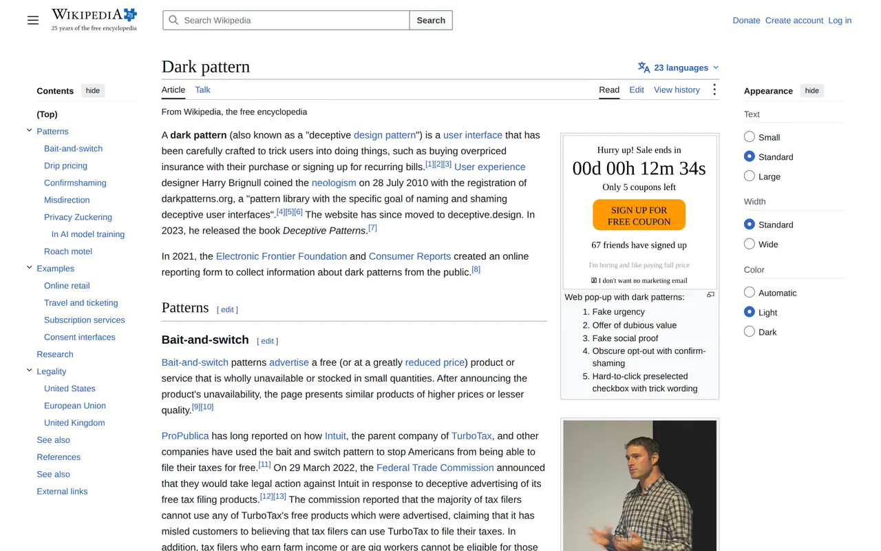
- Offer ends in09:59Fake countdownAnnex I point 7, unfair practicesBanned today
- Only 2 leftFake scarcityMisleading practice, UCPDBanned today
- Returns cover 4.99Pre-ticked extraConsumer Rights Article 22Banned today
- Service fee+6.50Total85.50Fees at checkoutTotal price before orderingBanned today
- 129.0079.00Fake discountLowest price of 30 daysBanned today
- (2,431)Fake reviewsAnnex I points 23b and 23cBanned today
- No, I prefer paying moreConfirmshamingDigital Fairness ActDFA target
- Cancel? Send a letterHard to cancelWithdrawal button, cancellation in DFADFA target
- settingsHidden declineNo valid consent, GDPRBanned today
- Wait! Not signed up yet?NaggingDSA Article 25, for platformsBanned today
Eight of the ten are banned today. The Digital Fairness Act aims at what is left.
| Trick | What it looks like | The rule today |
|---|---|---|
| Fake countdown | "Offer ends in 09:59", restarting on every reload | Banned outright: Annex I, point 7 of the Unfair Commercial Practices Directive |
| Fake scarcity | "Only 2 left" with a full warehouse | A misleading commercial practice under the same directive |
| Pre-ticked extra | Insurance or a donation already in the basket | Banned: extra payments need express consent |
| Charges at the last step | Delivery and service fees appearing only at checkout | The customer must know the total price before ordering |
| Fake discount | A struck-through price that was never charged | The prior price is the lowest of the last 30 days |
| Fake reviews | Five stars nobody checked, or bought ones | Banned outright since the Omnibus Directive |
| Confirmshaming | "No thanks, I prefer paying full price" | No specific rule yet; a target of the Digital Fairness Act |
| Hard to cancel | Sign up in one click, cancel by letter | Withdrawal button since 19 June 2026; cancellation in the Digital Fairness Act |
| Hidden decline | Accept all large, reject buried in settings | No valid consent under the GDPR |
| Nagging | The same pop-up every few clicks until you say yes | Banned for online platforms under the Digital Services Act |
Two nuances. The Digital Services Act ban covers online platforms: marketplaces, social networks, app stores, not an ordinary online store, which falls under the consumer directives. And what is on the blacklist in Annex I needs no proof that anyone was misled: the trick itself is enough. The full list of what an online store must show, from company details to returns, is in ecommerce legal requirements.
Dark patterns in UX and marketing: where the line is
Persuasion is not a dark pattern. A clear benefit, a real deadline, a social proof count that is true: all fine. The line is crossed when the design works against the user's own interest or hides information they need to decide. Good UX makes the user's choice easier; a dark pattern makes your choice easier for them. Marketing emails have their own version: a hidden unsubscribe link, or one that asks you to log in first.
What the Digital Fairness Act adds
The European Commission is preparing the Digital Fairness Act and plans the proposal for the end of 2026 in its work programme. Its 2025 consultation drew 3,341 replies, most from consumers, and a large majority wanted tighter rules on deceptive design. Recurring themes: confirmshaming and emotional pressure, cancelling as easy as signing up, addictive design in apps and games, and personalised pricing. Our news piece will carry the detail once the proposal is out. Until then, what is already banned matters far more than what is coming.
Since 19 June 2026 every store selling at a distance to EU consumers must also show a button to withdraw from a purchase in a few clicks; how it should look is in the EU withdrawal button. Around sales events enforcers look hard at struck-through prices; Black Friday 2026 in Europe has the rules per country.
Honest design sells too
Dark patterns lift one number in the short run: more clicks on Accept, more extras in the basket. They cost what you do not see at once: returns, chargebacks, complaints and customers who never come back. Conversion rate optimisation that lasts removes friction instead of building traps: the total price early, a checkout without surprises, a clear choice. A store that sells but never sees customers return often finds the reason there; see why is my online store not selling. A cookie banner can be honest too: reject as visible as accept.
The same choice, two screens
What an honest version of three familiar tricks looks like.
- Newsletter at checkout
- With a dark patternPre-ticked, in small print
- HonestEmpty box with one line on what you get
- Cookies
- With a dark patternAccept all large, reject in settings
- HonestAccept and reject side by side, same size
- Ending a subscription
- With a dark patternPhone during office hours
- HonestA button in your account, confirmation by email
- Price
- With a dark patternDelivery added at the last step
- HonestTotal price on the product page
An honest screen sometimes wins fewer clicks in a test, and fewer returns and complaints over the year that follows.
Dark patterns in a few lines
Do EU rules apply to a UK or US online store?
Yes, when it sells to consumers in the EU. Consumer protection follows the customer's country, and national authorities enforce it together through the CPC network.
Is every countdown timer a dark pattern?
No. A timer ending when the offer really ends is fine. One that restarts for every visitor is misleading.
What is the difference between a dark pattern and a nudge?
A nudge steers towards a choice that serves the user, such as a default to save energy. A dark pattern steers towards a choice that serves the company at the user's expense.